rider_hx <- read_csv("https://raw.githubusercontent.com/How-to-Learn-to-Code/Rclass-DataScience/main/data/wrangling-files/TDF_Riders_History_1919-2023.csv")

stage_hx <- read_csv("https://raw.githubusercontent.com/How-to-Learn-to-Code/Rclass-DataScience/main/data/wrangling-files/TDF_Stages_History_1919-2023.csv")Applying Data Wrangling Skills
Data Wrangling, Day 2 (Tour de France edition)
Objectives of Data Wrangling: Class 2
- Be able to apply the objectives covered in Data Wrangling: Class 1 to a new dataset
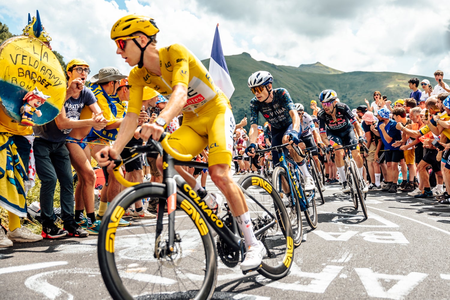
Case Study: Tour de France 🚴
Bienvenue en France! 🇫🇷 Today we are traveling across the Atlantic Ocean to conduct urgent data analysis for Team Visma-Lease A Bike (Team VLAB) for the Tour de France. The Tour de France is an annual multi-week bicycle race held primarily in France. The race comprises 21 stages held over 23 days. Each stage covers a different area of France and different terrain; and the course changes each year. There are 20 to 22 teams that participate each year and each team is made up of 8 riders.
The year is 2024 and this year’s tour, as in prior years, is a nail-biter between Team UAE’s Tadej Pogačar and Team VLAB’s Jonas Vingegaard. So far, 14 stages and nearly 1,300 miles have been completed and Jonas is trailing his rival Tadej by just one minute and fourteen seconds. Stage 15 is tomorrow, and Team VLAB wants to know if Jonas has a chance to make up time and win the Tour. To help determine race strategy, Team VLAB wants you to analyze historical trends.
Part 1: Analyzing historical trends
The data
We are given two files: one with rider history, and one with stage history. Note that only cyclists who have completed the race are included in these files. These files only contain data for Tours 1919 and later. The Tour was not held between 1940 and 1946 due to World War II. This data is modified from the original files provided by thomascamminady in LeTourDataset.
| Column Name | Description |
|---|---|
| Rider | Name of the cyclist |
| Team | Name of the team. Note that because teams are named for their sponsors, team names can vary slightly from year to year |
| Times | Cumulative time provided in hours, minutes, and seconds (e.g. 114h 35' 31'' ) |
| Gap | Amount of time behind race winner provided in hours, minutes, and seconds |
| Year | Year of race |
| Distance (km) | Total distance in km of that year’s race |
| Number of stages | Number of stages in that year’s race |
| TotalSeconds | Cumulative time in seconds |
| GapSeconds | Amount of time behind race winner in seconds |
| Column Name | Description |
|---|---|
| Year | Year of race |
| TotalTDFDistance | Total distance in km of that year’s race |
| Stages | The stage number for that year’s race |
| Start | Name of the city in which the stage started |
| End | Name of city in which the stage ended |
| Winner of stage | Stage winner |
| Leader | Race leader (prior to use of the yellow jersey, only a race leader was tracked). NA for years > 1914 |
| Yellow Jersey | Race leader for years > 1914 |
| Polka-dot jersey | Rider with the greatest number of points in the Mountains classification. Awarded for races in years >= 1975 |
| Green jersey | Rider with the greatest number of points (which generally ends up being sprinters, so this is often called the sprinter’s jersey). Awarded for races in years >= 1953 |
| White jersey | The fastest rider under the age of 23. Awarded for races in years >= 1968 |
Let’s read in the data and dig in!
- Use your favorite function to check out the data frame real quick. Options include:
head(),glimpse(), andstr(). Would you consider this “tidy” data? - These column names are not very…tidy. You may notice inconsistent capitalization, spaces (which make our coding lives difficult) and special characters. Use the
rename()function to rename columns in a consistent format. - Take another look at the rider history data. You may notice that some columns are duplicative: we have two different columns for total time and time gap, just in different units. But do these contain the same data? It’s entirely possible that there are discrepancies and that could be something to flag before we begin analysis.
- First, use the function
str_extract()to place the hours, minutes, and seconds into three separate columns. Convert the hours and minutes columns to seconds usingmutate() - Create a new column called
new_total_secondssumming the new hours, minutes, and seconds columns. - Then, use
filter()to identify rows where the total seconds you just calculated doesn’t match the one in the TotalSeconds column originally provided in the data. Which column should be used for analysis? - Bonus challenge: Write a function that will do a & b!
- First, use the function
- Let’s add a few columns that will help with analyzing trends:
- Total distance in miles
- Average speed in km/h and mph
- Identify the winner each year using the rider history dataset.
- First, write out in plain language how you would do this step-by-step, similar to what is done in 3a-c.
- Do you notice if any of the words you used above correspond to dplyr functions?
- Need a hint? As with many coding tasks, there are many ways to do this! You may want to start by using
group_by()andsummarize(). You can also try looking up a function to select the smallest row in a group in R.
- Team VLAB is getting antsy–let’s make some plots. Pick at least one of the analysis questions below and make a plot that helps answer the question. It may also be helpful to calculate a summary statistic (e.g. mean).
- Have winners of the Tour gotten faster over time?
- Has the average speed per year gotten faster over time? This would be the average speed of peloton.
- How does Jonas’ average speed compare this year to prior years? What about Tadej’s?
- BONUS if you like scandal! Identify the winner each year using the rider history dataset (you may have done this in #6). Examine the ranges/values in each column. Notice anything weird for any particular years?
Part 2: Incorporating this year’s data
Team VLAB has handed you data with rankings though Stage 13 (remember, Stage 14 of 21 is tomorrow). The team is interested in knowing how Jonas’ speed this year compares to previous years.
Read in the dataset.
tdf_2024_df <- read_csv("https://raw.githubusercontent.com/How-to-Learn-to-Code/Rclass-DataScience/main/data/wrangling-files/tdf_2024_stage13_data.csv")- Try using
rbind(),bind_rows(), andmerge()to join the new data with the rider history data from above. Which one(s), if any, work? Why do you think they do (or do not) work? - If you need to make any modifications to the new data to enable a join, do so and then join the datasets. Make these changes in R, NOT Excel or a text editor. Doing so in R ensures that your changes are reproducible and that the original data is not destroyed or modified.
- Use this new dataset to add this year’s average speed to the same plots you made in Part 1.
- Write this new dataset to a new comma-separated file. See if you can write the file using one of these functions:
write.csv(),write_csv(), andwrite.table(). Use the help pages for each of the functions to explore the difference between each. Which one will you probably use the most in your own analyses?- Verify you can view this file using the file explorer on OnDemand, and download to your computer. If the file does not look like you expected, review the help pages for the function you used.
- Review your code from Parts 1 and 2. See if you can use pipes to connect as many steps as possible. As you do this, make sure you add comments to your code and consider if using too many pipes sacrifices code readability.
Part 3: Stage History
The stage history dataset has data from every stage of the Tour de France. For the below questions, use your data wrangling skills to find the answer.
- Use
rename()to tidy the column names. - Check for missing values in each column. Are all missing values coded the same? If not, figure out a way to fix this–you may want to use Google!
- Which city has had the most visits from the Tour de France? (This means you must consider both start and end cities)
- Who has won the most stages?
- Who has worn the yellow jersey for the most days in a single tour? What about the polka dot jersey? Green jersey?
- Identify the top 10 wearers of the yellow jersey, polka dot jersey, and green jersey. Make a bar plot with the name of the rider on the x-axis and number of stages/days worn on the y-axis. See if you can color the bars so that the colors match the jersey (i.e. the plot for yellow jersey has yellow bars).
- See if you can get these all plotted on the same plot. It might involve some pivoting!